Vision Care Updates
Timeline
July – September 2024
Design Team
Nina Gao, Austin Critchlow
Contribution
User Research, User Experience Design, User Interface Design, Usability Testing
Tools
Figma, Maze, Hotjar, Statsig
At XP Health, a vision care startup, I redesigned the vision care section of the B2B platform to manage eye exams, insurance, and reimbursements. The original experience was cluttered and unclear, leading to slow task completion. I restructured it into focused subpages and redesigned the main page to highlight quick actions and guide users through the care journey. Usability testing and post-launch data showed strong gains in speed, success rate, and engagement.
Outcome
-14s
Task completion time (testing)
100%
Task success rate (testing)
+54s
Avg. engagement time
+319
Event count
-0.28
Views per active user
+2%
Net promoter score
In usability testing, the task success rate increased from approximately 76% to 100% after the redesign, while average completion time dropped by 14 seconds—demonstrating both improved usability and efficiency.
After the launch, average engagement time per user increased and event count rose—despite a drop in views per user. This suggests users were spending more time engaging meaningfully with fewer pages, likely due to improved navigation, clearer layout, and more focused content. Additionally, our Net Promoter Score (NPS) increased by 2%, indicating a boost in overall user satisfaction.
Previous designaa

Current designaa

The Problema
The previous Vision Care page contains several modules of information and CTAs that are text-heavy and have limited hierarchy. Overtime, the continuously added modules creates more visual complexity and thus become difficult for users to navigate. The page layout also doesn't align with the visual style of the current home screen. These led to negative user feedback and detractors in NPS.
Previous Vision Care pageaa
Below is the previous Vision Care page. By looking at feedbacks from our members, we discovered that there are many usability issues in the experience. Below are real quotes from our members:
"Where's the online form? I can’t find it anywhere."
"The plan details are confusing — please explain them better."
"I don’t have an eye doctor, and finding one here feels impossible."
Current home screenaa
To ensure a consistent experience across the platform, we also wanted to update the visual style of the vision care page to align with the current home screen.

Concept developmenta
To understand the pain points and behaviors around the previous vision care section, I used a combination of qualitative and quantitative research methods. After synthesis, I concluded the key findings and defined my design goals.
Research methodsaa
- Screen recording:
Analyzed real member sessions to uncover behavioral patterns and navigation struggles. - In-depth interviews:
Conducted think-aloud usability sessions with online-recruited participants as they completed key tasks (e.g., finding an eye exam provider, checking insurance info). - Maze usability study:
Measured task completion time and success rate for common actions in Maze (a usability testing platform). This baseline study would later be repeated with the redesigned dashboard to validate improvements.
Key findingsaa
- Two distinct user types emerged:
Goal-oriented
Users who want to quickly access a specific service (e.g. reimbursement)
Exploratory
Users who want to understand what to do and where to start.
- Information was hard to scan:
Action items were buried in dense text blocks;
Titles and buttons weren’t clearly distinguished or prioritized. - Task success was suboptimal:
Task completion time averaged around 22s and success rate averaged around 76%, showing the design wasn’t fully supporting user goals.
Design goalsaa
Based on the insights, I defined three primary design goals to guide the redesign:
- Create an intuitive experience for both user types —
Ensure that users with a clear goal can quickly self-select specific services, while also supporting users who need guidance through the full vision care journey. - Improve information clarity and action visibility —
Simplify the interface by reducing cognitive load, clarifying section hierarchy, and making important actions easy to spot and understand. - Align visual style with the current home screen —
Ensure consistency in UI elements, typography, and layout patterns to create a cohesive experience across the platform.
Design Solutiona
From rethinking the information architecture to refining the visual layout, each design decision was grounded in research insights and usability testing. Below, I break down the redesigned flow and interfaces across web and mobile.
Information architectureaa
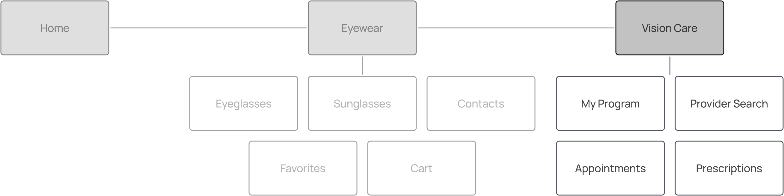
Instead of crowding all content into a single page, I broke Vision Care section into four focused subpages—My Program, Provider Search, Appointments, and Prescriptions—mirroring the existing structure of the Eyewear section. Information categorization and tab names were tested through 15 Maze card sorting tests.
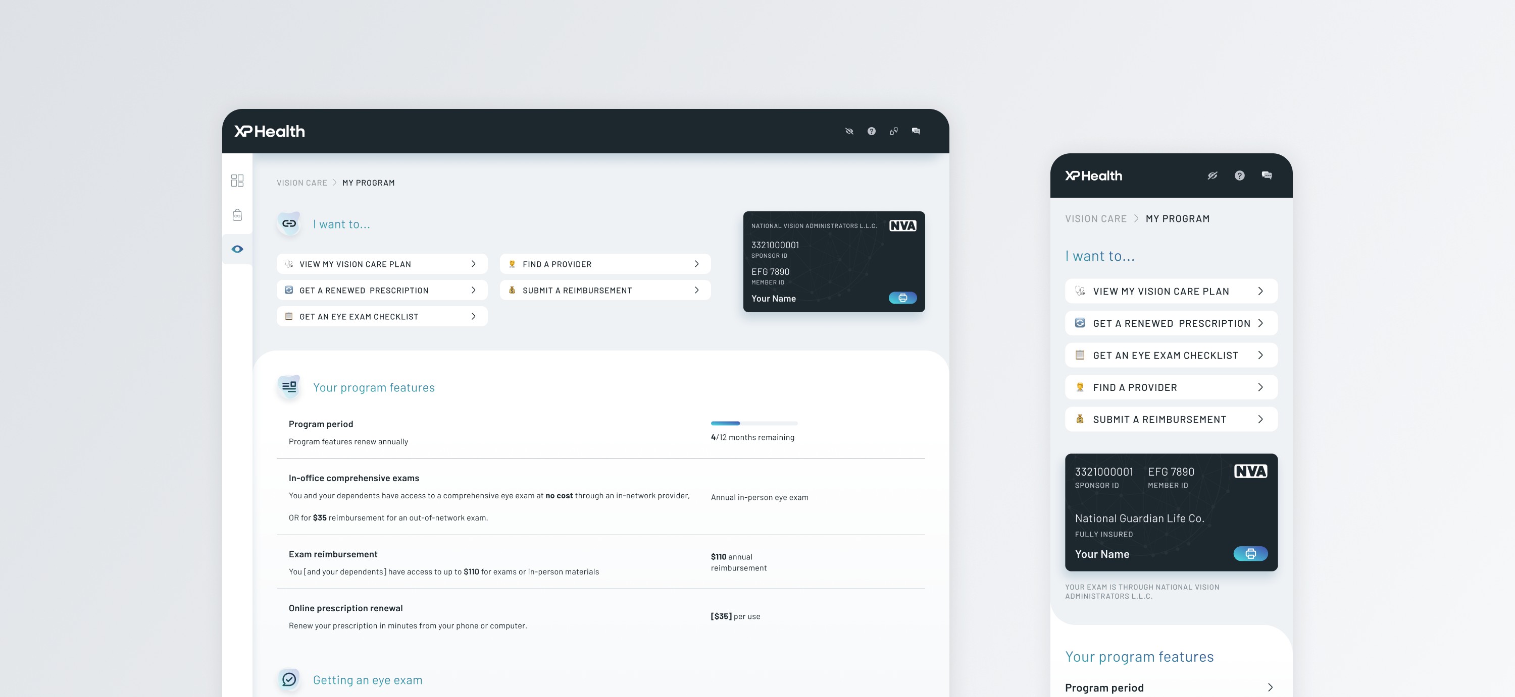
My Program pageaa
On the first page — My Program — I introduced quick action buttons at the top to help goal-oriented users easily access frequently used features. Below that, a program overview supports all users in understanding what’s available. Finally, a clear three-step linear flow guides exploratory users through their vision care journey.